As we tie a bow around 2017 it is always fun to look back at the design projects that crossed our “drafting table.”
Our project list in 2017 was diverse, from hotels to travel centers and medical offices to assisted living facilities. Oh, and restaurants, lots of restaurants.
Here is a look back at a few of the projects that kept us busy this past year.
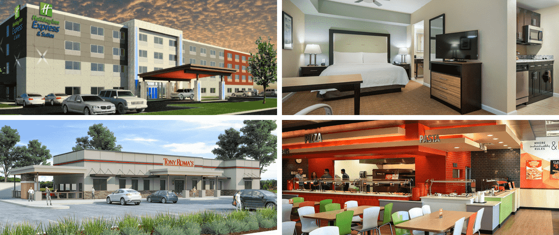
Tony Romas – A Brand Transformation
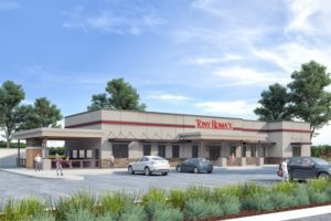 This beautiful redesign is a direct result of the brand transformation undertaken by Tony Roma’s in 2016. The new restaurant design includes a complete overhaul of the restaurant atmosphere, service platform, and menu following extensive consumer research. The new concept includes a modern décor, flexible dining spaces, and a beautiful bar that services customers inside the restaurant as well as those dining on the outdoor patio.
Travel Centers – Not Just for Truckers
 Travel Center design has come a long way. Sitting on over 20 acres off I-10 in north Florida, this will be our largest travel center design to date. With 6 truck fueling lanes and 32 auto dispensers this center will be able to serve hundreds of vehicles per hour. Over-the-Road drivers will enjoy full-service amenities including large restrooms with showers, a laundry facility and multiple food and product offerings.
Hotels. Hotels. Hotels.
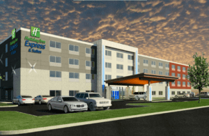
We are excited to have several hotel design projects in process. One recently opened (Homewood Suites in Augusta, GA) and 3 are slated to open within the first half of 2018: (Holiday Inn Express, Hilton Home2, and Marriott Springhill Suites). MRP Design Group worked side-by-side with civil engineers to craft site plans that creatively managed the usage of each the property while maximizing value and profitability for each individual hotel concept.
Dentistry for Children

MRP Deign Group worked with a team to design this ground-up dental office. With multiple offices in the Atlanta area, Dentistry for Children isn’t just a dentist office. It’s a place children look forward to visiting and where parents are just as comfortable as patients. This goal drove our design as we incorporated bright, vibrant colors and focused on making the entire office feel welcoming and kid-friendly.
CiCis Brand Reimaging
 Cici’s new brand imaging embodies a new brand identity, focused on feeding individuality. The updated “Maverick” prototype embodies Cicis recently clarified brand character, described as “unconventional, brave and independent.” Guests will immediately see the difference inside as they encounter an entirely new vibrant and energetic color palette. Cicis has completely redesigned the dining room with creative space features like the SPARK shutter wall to display the new brand symbol, chevron-style table top patterns, tables that seemingly come out of the wall and a newly designed game room.
